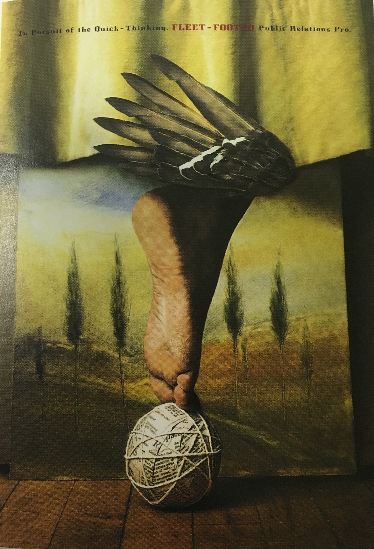
Richard Hollant created this design. This piece was created to illustrate the entrance to Mercury Awards for recognizing the outstanding works in the public relations in the communication and marketing fields. The clients for this design are the members Public Relations Society of America.
I think this design is well done and well balanced, but I see one issue with the text. Mr. Hollant should have, I think, let the text stand out a little more because it was kind of hard to read the message; especially where the bright areas are.
Mr. Hollant used these designs in a collage style to make a striking cover and on the inside page was a pretty photo of a white feather symbolizing quickness. Both the cover and inside pages have well balanced colors, and he emphasizes the images of a ball, footed wing, and feather, which are symbols of quickness. I do not see evidence of use of grid structure; maybe where he was placing text. The hierarchy elements are present in text and images. For example, in the text he emphasizes “FLEET-FOOTED” in red and all capital letters, and the footed wing, ball, and feather are placed in center of the design.
Mr. Hollant’s design intrigues me because I think it is amazing how he used different things: a foot, wing, ball, and feather in order to unite his message to his audience. I learned that you need to go beyond the obvious and create something you would think would never go together to create a unified message.


